
You are looking at restaurant website examples for one reason: you want ideas that work. Here is the shortcut. The sites that actually fill tables aren't getting there with a fancy look. They get there with five things. The menu is the first thing you see. It loads fast on a phone. It looks like this year, and it is easy to move through. It makes the next step obvious. And it shows up when someone searches you at 6:40 on a Friday.
Copy those five. Skip the rest. Here is what each one looks like in practice.
The menu is basically the homepage
Two people sit in a parked car, phones out, deciding where to eat. One pulls up your site. If the menu is buried, or it is a blurry PDF from 2021, they are already reading the place down the street.
85% of diners look at a restaurant's online menu before picking a new spot. So on the best sites, the menu is not hidden behind a tab. It is right there, readable on a phone, no pinching, no download. Prices visible. Real photos on the dishes that sell themselves.
On the good ones, the menu isn't a page. It basically is the site.
It has to be fast on a phone
Your customer is standing in a lot with three other options one thumb-swipe away. Your site gets about three seconds.
More than half of mobile visitors leave a page that takes longer than three seconds to load. And 36% of diners have backed out of ordering because a restaurant's site was not mobile-friendly. The best examples feel instant. They open, the menu is there, the number taps to call. No spinning, no desktop site crammed onto a phone.
Fast isn't a nice-to-have. It's whether they wait or leave.
It looks like now, and it gets out of your way
People judge quick. A dated site does not read as charming. It reads as closed, or careless, or gone.
30% of diners have been put off by a website that looked old. Another 33% left because it was hard to navigate. Add it up and a bad website has scared off 68% of diners at some point. The restaurant website examples worth copying look current and stay simple. Clean type. Photos of the actual room and plates, not stock. One clear path from landing to booking.
It makes the next move obvious
Every good restaurant site answers three things without making anyone dig: what you serve, whether you are open, and how to get a table.
Watch the best examples. The reservation button follows you down the page. The address taps straight into maps. The hours are not a scavenger hunt. Nothing on the page is decoration. Every piece points the customer toward walking in.
A pretty site that hides the reservation link isn't a good site. It's a nice-looking dead end.
Three Hill Country restaurant sites worth a look
Want to see it in the wild? Three Hill Country spots that get their site right. Steal what works.
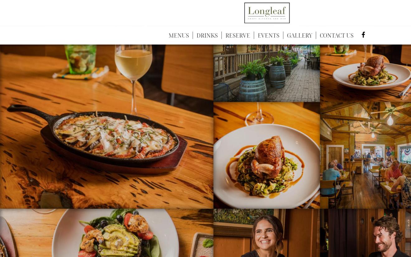
Longleaf, on the Wimberley square, keeps the menu easy to read on a phone and the whole place easy to move through. See it at Longleaf Craft Kitchen + Bar.
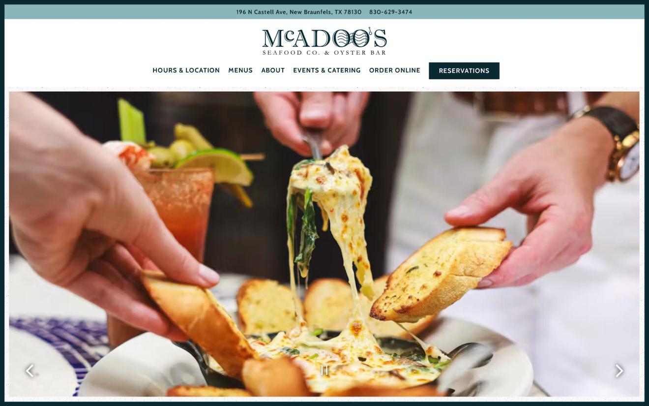
McAdoo's in New Braunfels leads with the food and makes the next step obvious. Take a look at McAdoo's Seafood Co.
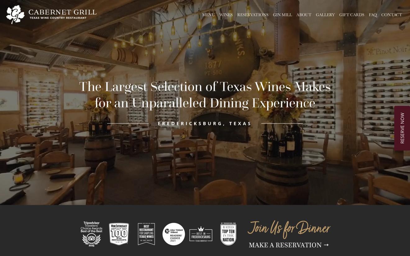
Cabernet Grill in Fredericksburg looks the way the room feels, upscale and current, wine country through and through. See Cabernet Grill.
Why the best restaurant website examples still won't fill your tables
Here is the catch. You can study restaurant website examples all week and still end up with a site that loses the parking-lot test.
The examples show you the what. They do not hand you the build: the speed, the mobile menu, the real photography, the one clean path to a booking, all tuned to your actual restaurant. That is the part that fills tables, and it is the part a template usually fumbles.
Want to see where yours stands? Run the free audit. It scores your site against the top three restaurants in your town, on Google and with AI, in about a minute. Or see how we build restaurant websites that pass the parking-lot test every time.